Beauty of Choice Campaign
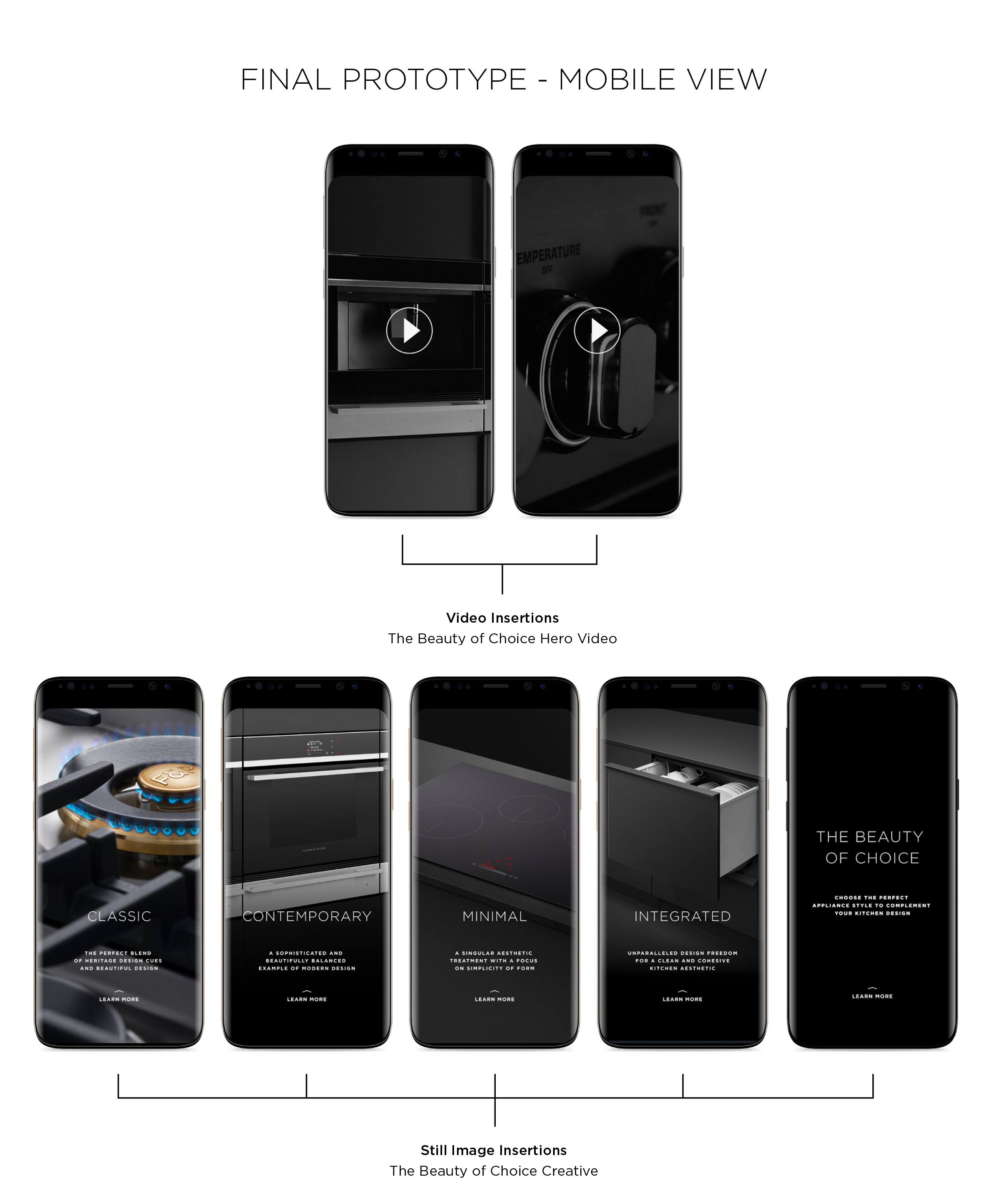
This was a social media deliverable to be produced for the campaign 'The Beauty of choice'. I was working on quite a few deliverables like HTML5 banners, Insta stories, facebook carousels and other collateral for this campaign. This campaign was an intro for the different ranges that were to be introduced in the near future by Fisher and Paykel Appliances. Namely Classic, Contemporary, Minimal, Integrated etc,. The job was to create instagram frames which convey the message of 'The Beauty of Choice' but not show the products as they are to be released in near future. I started prototyping and creating scamps on Figma as shown below. The idea started with just trying to show a glimpse of kitchen (as we could not show product) to slowly minimising it to just show three frames. After consulting the marketing head of the social and art director something we felt could work was close up of each style without revealing the product. The call to action button for all the frames would direct to 'The Beauty of Choice' page on the website.


